-
Welcome to Elio Owners! Join today, registration is easy!
You can register using your Google, Facebook, or Twitter account, just click here.
You are using an out of date browser. It may not display this or other websites correctly.
You should upgrade or use an alternative browser.
You should upgrade or use an alternative browser.
Elio Motors Town Hall Meeting With Paul Elio - August 16, 2014
- Thread starter goofyone
- Start date
eddie66
Elio Addict
- Joined
- Apr 12, 2014
- Messages
- 1,341
- Reaction score
- 4,069
I thought what I read said that was an example of what they had in mind. I doubt you will see anything like that on the production model. If they put it on the 25 cars they plan to tour with, I'm sure the feedback they get from the general public will convince them to change it on the production model. If they don't we "older, more affuent" customers will opt for an after market replacement dash. Or, you could alway express your disdain buy not buying it. Let them keep that $1000. That'll show em.The above picture is what they did actually come up with, thus the problem.
RogWild
Elio Addict
- Joined
- Jan 9, 2014
- Messages
- 373
- Reaction score
- 641
If they keep the 'goofy' Elgin ('SB') design, and they opt for the OBDII port; I'll just drop a couple of hundred..... get an old iPad, or android tablet (already have)..... get a 'Dash app'..... and have a FUNCTIONAL instrument cluster. If the above was just "an example of what they had in mind"...... then they wasted a lot of engineer's time and fabricator's..... to make a 'realistic mock-up'.
Last edited:
outsydthebox
Elio Addict
- Joined
- May 6, 2014
- Messages
- 1,747
- Reaction score
- 5,007
If they keep the 'goofy' Elgin ('SB') design, and they opt for the OBDII port; I'll just drop a couple of hundred..... get an old iPad, or android tablet (already have)..... get a 'Dash app'..... and have a FUNCTIONAL instrument cluster.
Outstanding idea! I have been thinking the same thing. Simple, modifiable...
Bottom line - it's PE's car. If he wants an Elgin Dash with friggin lasers, that's what he's going to get.OK, nice to know that they are not going to use an actual 'spinning dial' behind that large silver circle (although their 'picture' does not convey that). The large 'mass' of a disk would be slower to react than a thin, skinny, needle on a regular gauge. Conveying the 'illusion' of a 'Spinning Disk' with a digital module will be interesting, but DISTRACTING...... and also require a 'programmer' to develop this feature (additional expense). If those large silver circles are NOT hiding a 'spinning disc) behind them, then all that silver area on the dash is just for 'show', and WASTED AREA...... that could be used to display 'Engine information' larger and easily readable at a GLANCE. The small area behind the steering wheel on the dash, must QUICKLY convey vehicle information to the driver, with the least TIME, diverted from the Driver's primary task of keeping the vehicle safely on the roadway. Having the 'Idiot Light' icons CLUMPED together, causes the driver to focus on the illuminated one (to identify the SHAPE of the 'icon', to determine the information, and not just by the 'relative position' of the warning indication...... again taking the driver's eyes away from the road. See photo; GREEN area (information provided), YELLOW area (WASTED SPACE).View attachment 2262
This is great Information! Once again, I am impressed with PE's combining practicality with design, while still giving tribute to his father. I am also glad that his father was not a proctologist!


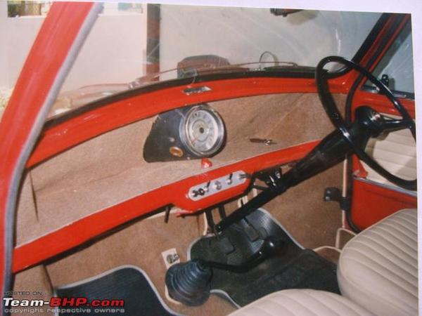
then the dash might look like this?
eddie66
Elio Addict
- Joined
- Apr 12, 2014
- Messages
- 1,341
- Reaction score
- 4,069
Another article from AOL
Http://www.youngherald.com/elio-mot...er-vehicle-looking-for-federal-fundinhg/1041/
Http://www.youngherald.com/elio-mot...er-vehicle-looking-for-federal-fundinhg/1041/
zelio
Elio Addict
Now THAT dash sucks! LOL :-) Zthen the dash might look like this?

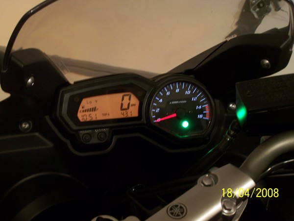
We could always just take the dash out of my Yamaha: 


